Context
Alida helps big brands like Amazon Studio understand their customers through advanced market research tools like surveys. I was hired to improve their outdated research platform and their survey experience.
Problem II
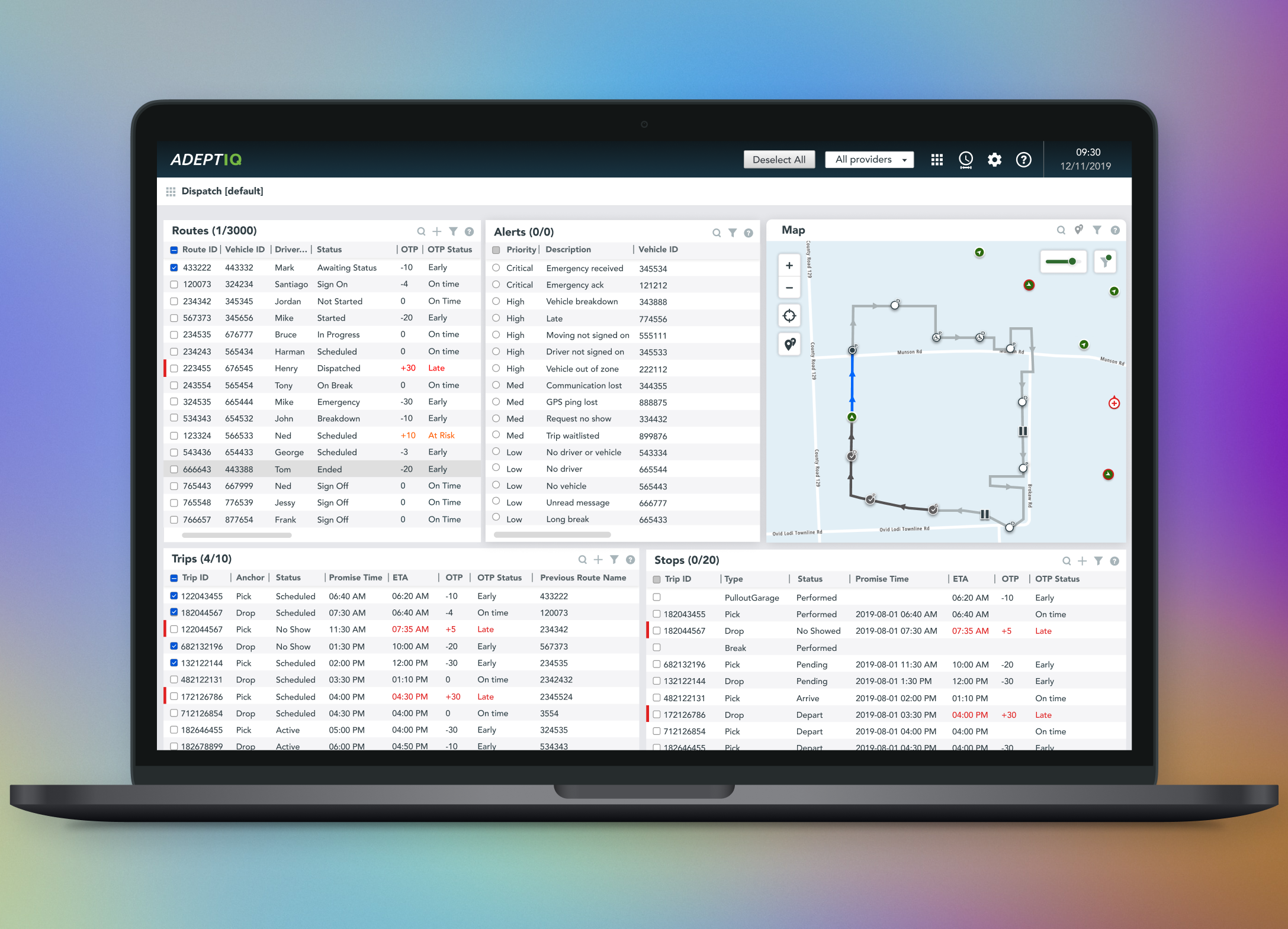
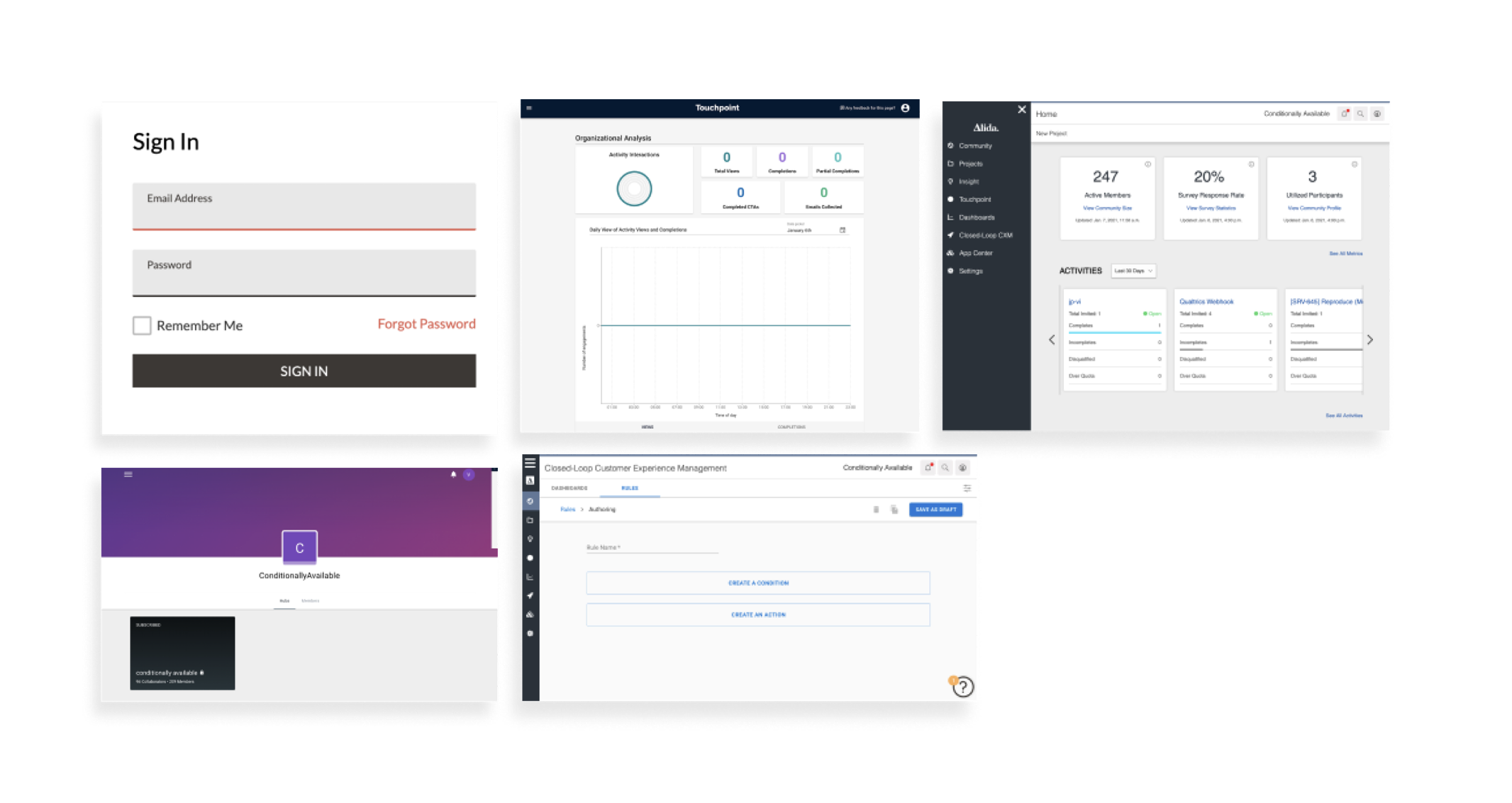
When I joined in 2020, Alida had six separate products with no shared design system. Engineers and designers spent extra time maintaining duplicate components and inconsistent code, which slowed development and made scaling difficult.
Research I
I audited Alida’s six products to document all UI components and spot inconsistencies. Working with designers and engineers, we found duplicated work, mismatched styles, and confusing user flows. I presented these issues to leadership, showing how inconsistency slowed development and hurt the user experience. With their support, I led the creation of a unified, Figma-based design system—drawing on best practices.
Research II
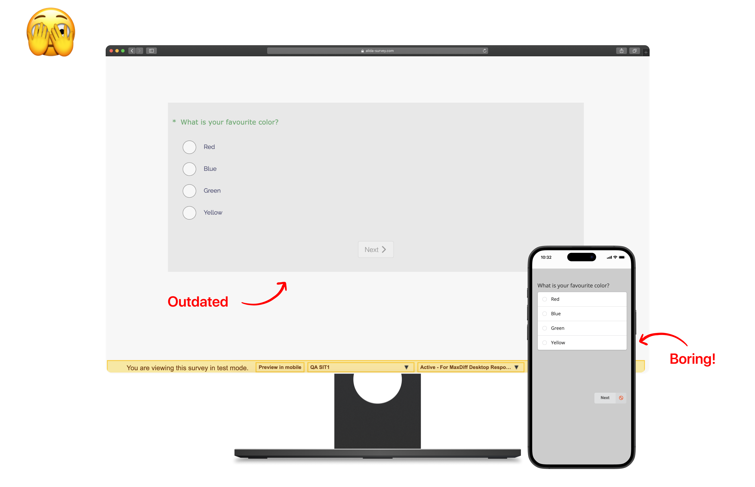
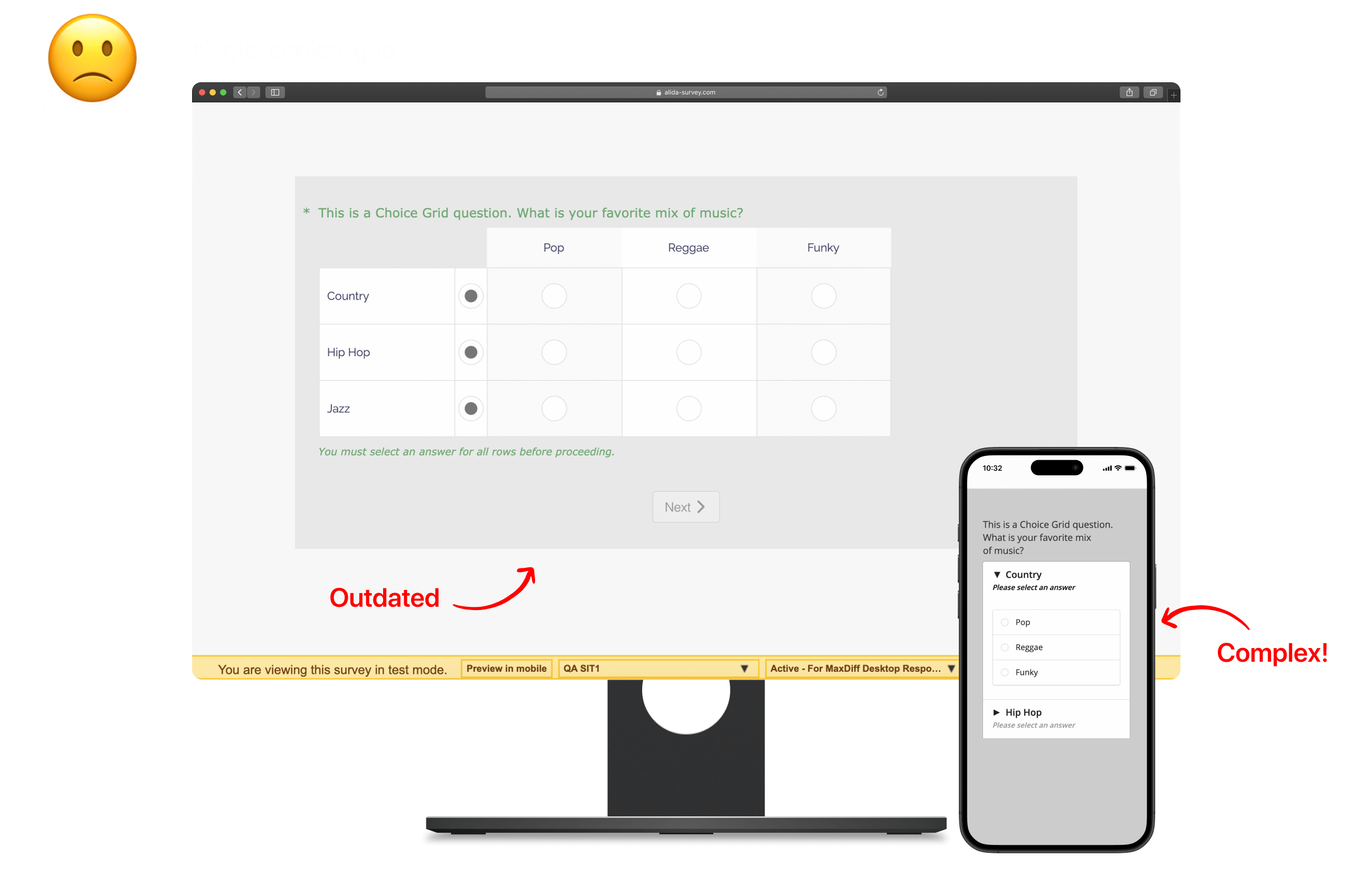
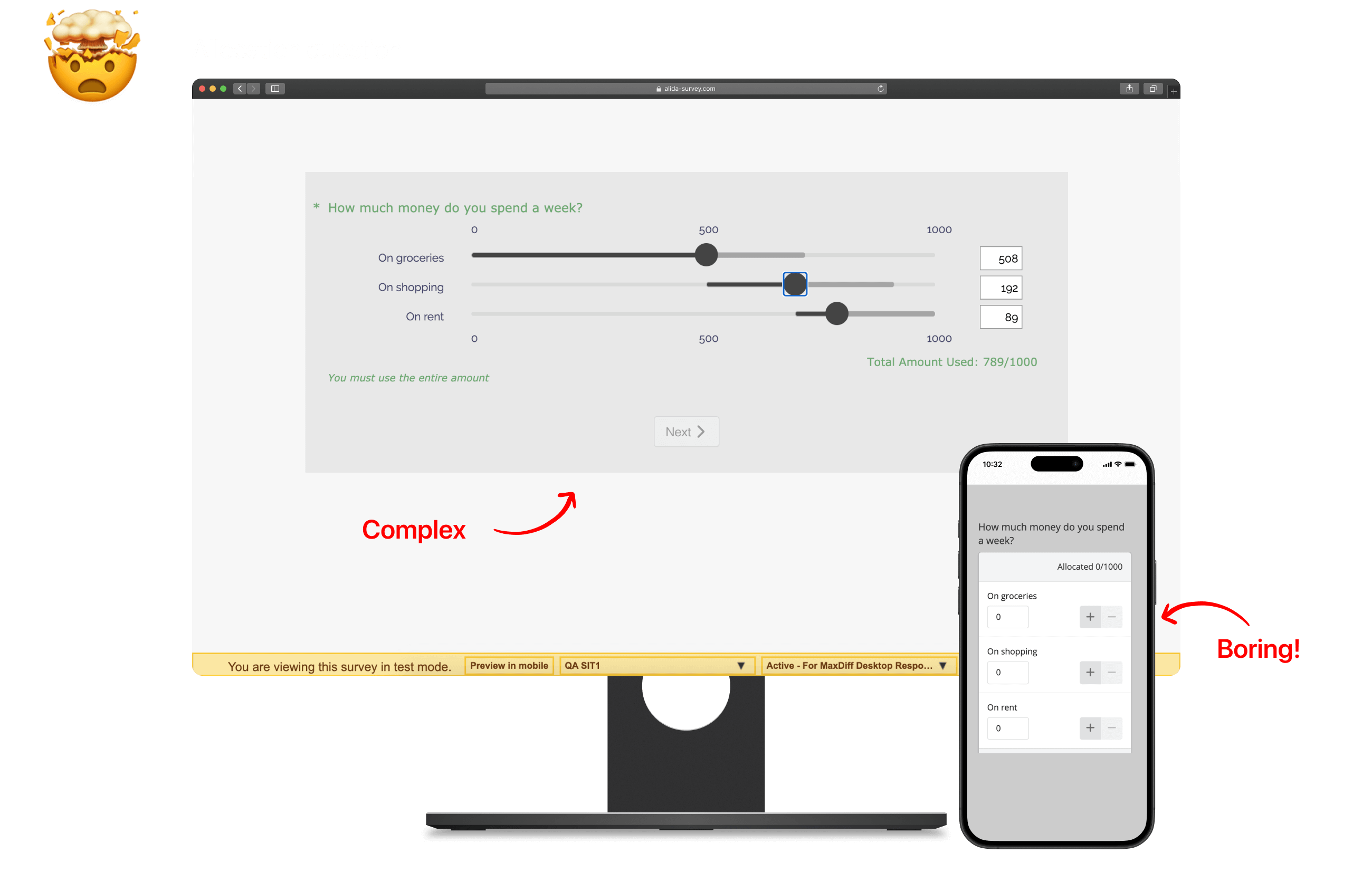
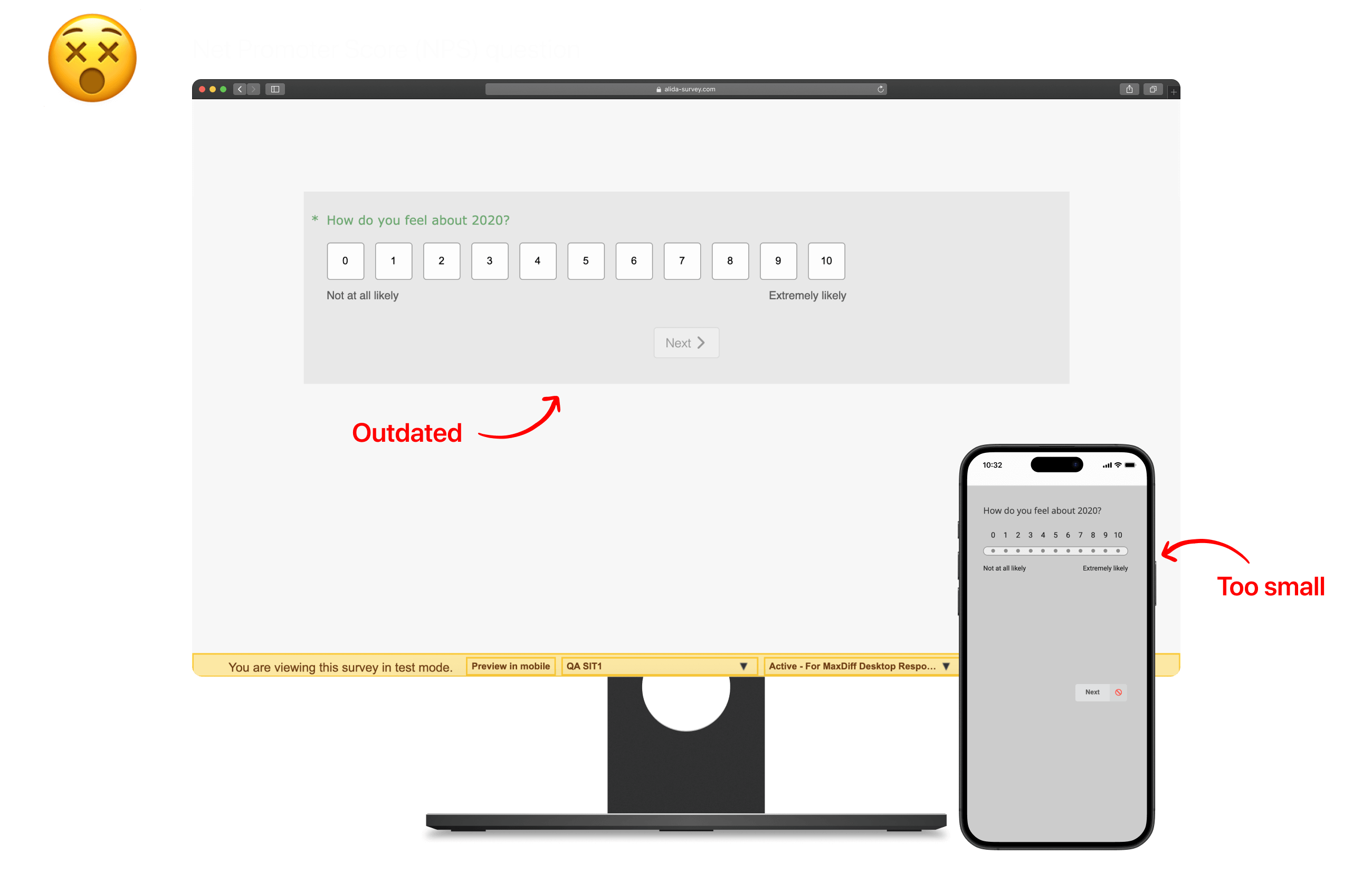
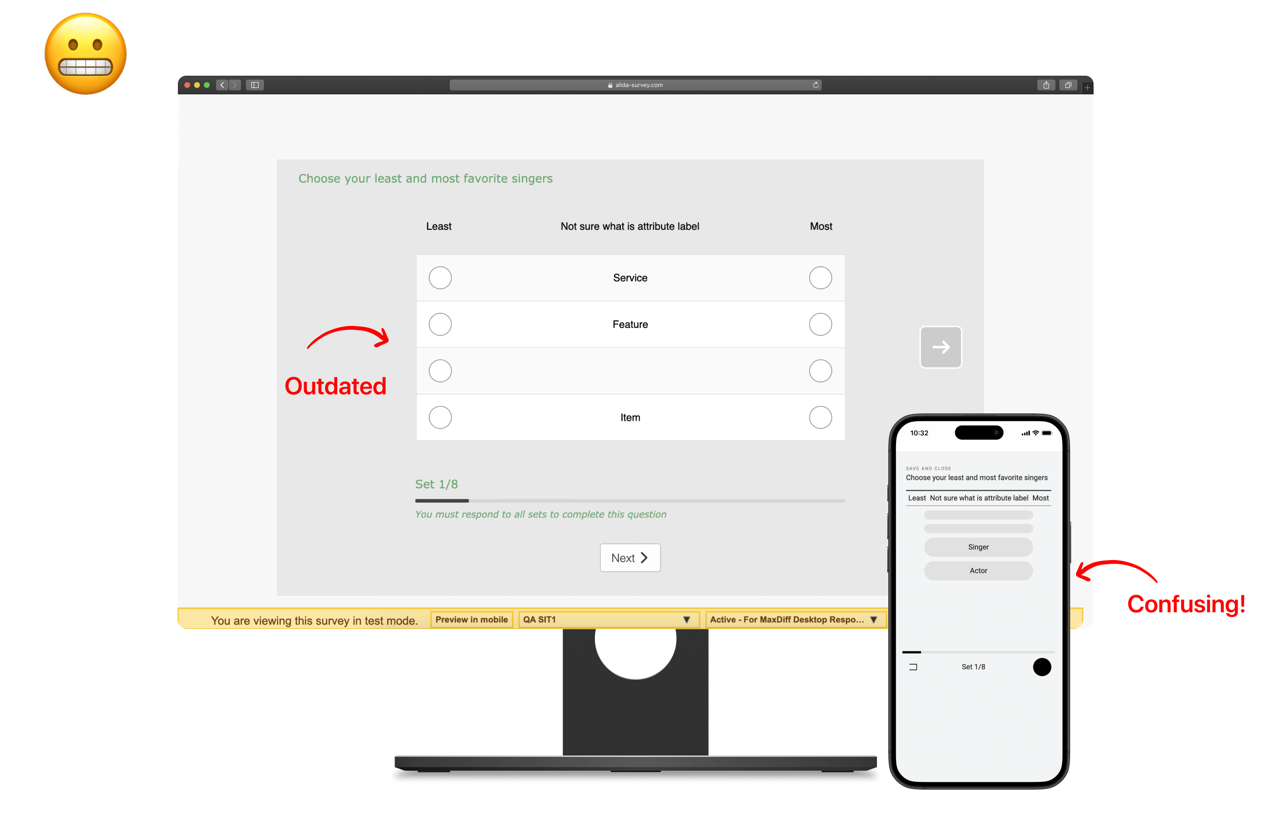
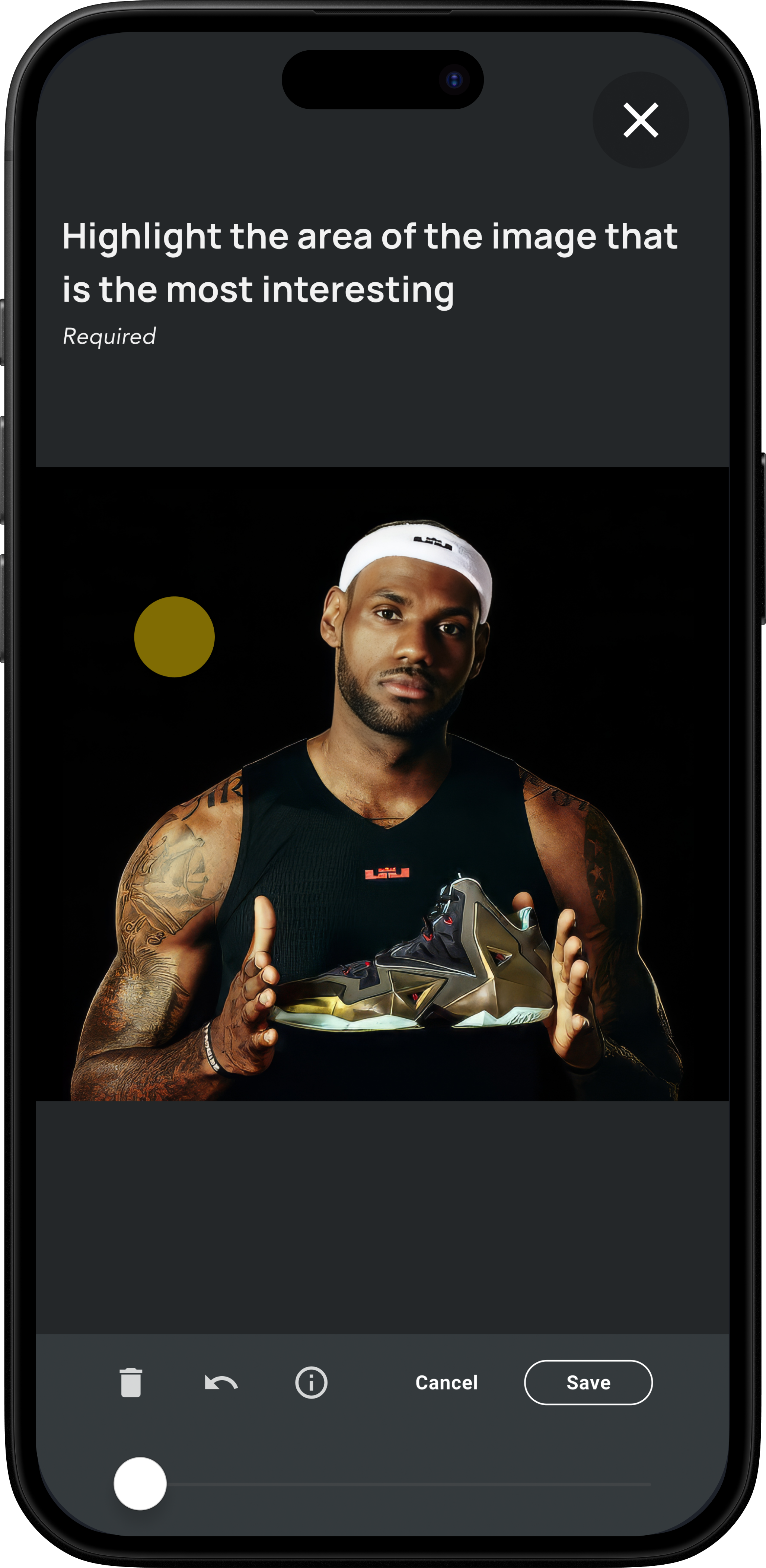
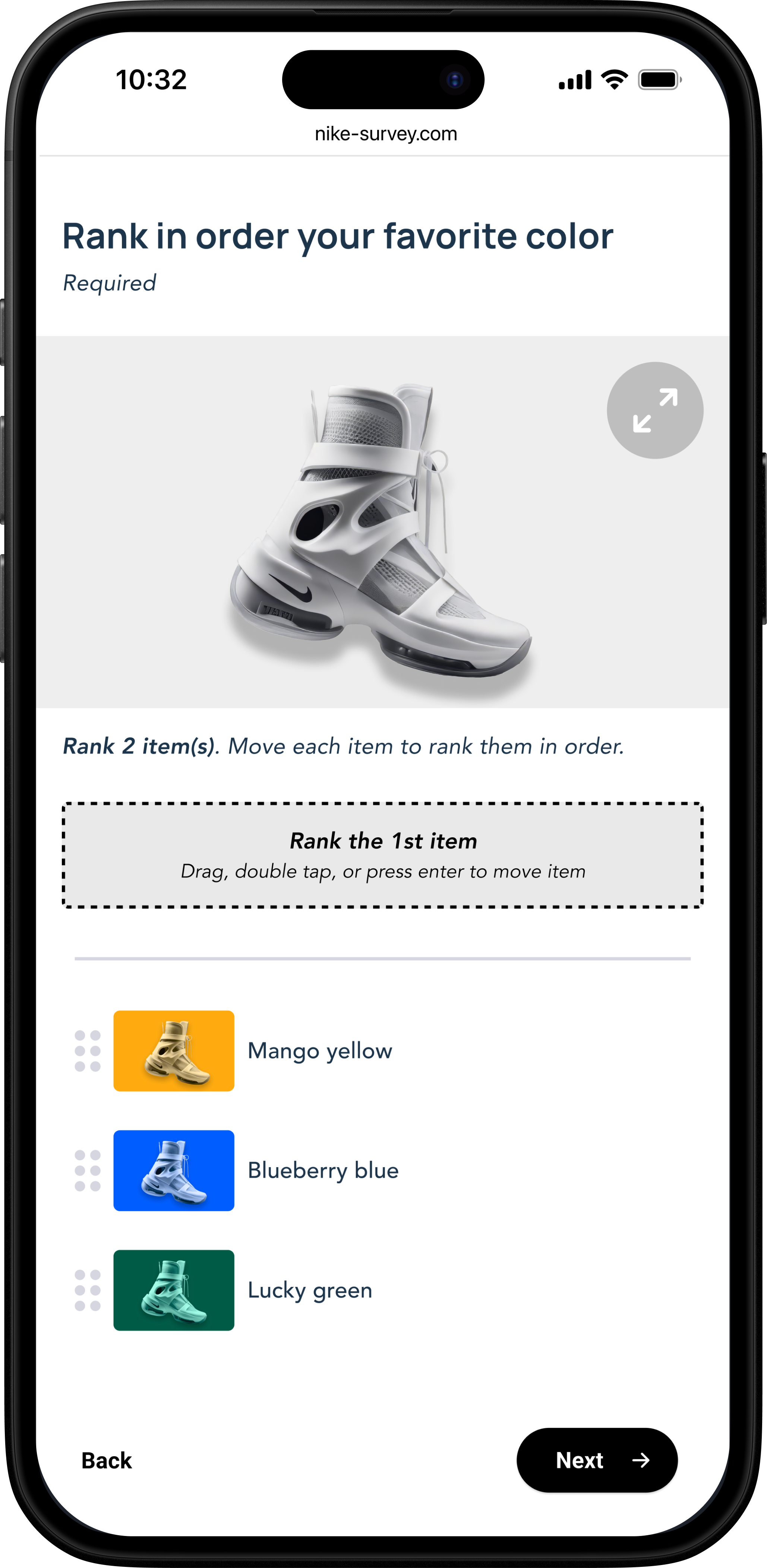
I conducted user interviews and usability tests to validate the mobile-first survey designs and image-based questions. Insights from real users led to streamlined layouts, intuitive navigation, and touch-friendly interactions that improved overall usability.
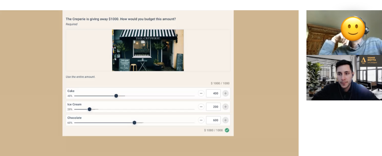
I ran competitor analyses, interviewed subject matter experts, and tested designs with users—especially for complex question types like grid selection and allocation tasks. Feedback shaped every decision.
Solution part 1
I led Alida’s first unified design system to solve major inconsistencies across six products—mismatched styles, clashing typography, and fragmented components. This single source of truth improved usability, sped up development, and strengthened the brand.
Solution part 2
With the new design system, all six Alida products now share a unified, consistent look and feel. This makes navigation easier, improves usability, and reduces confusion for users. Teams work more efficiently, and updates are faster and easier to maintain.
Solution part 3
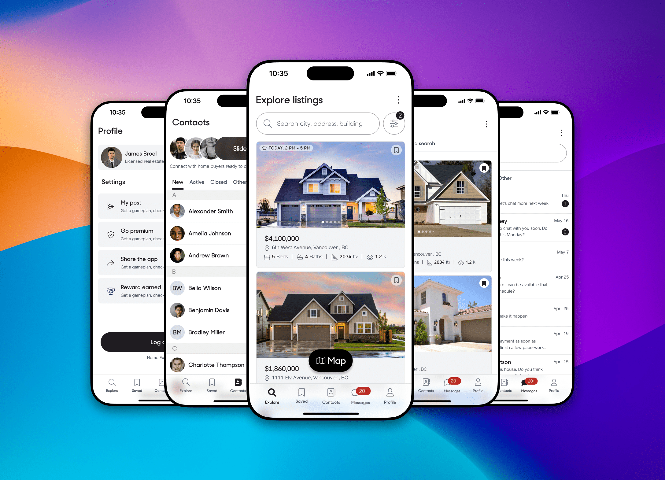
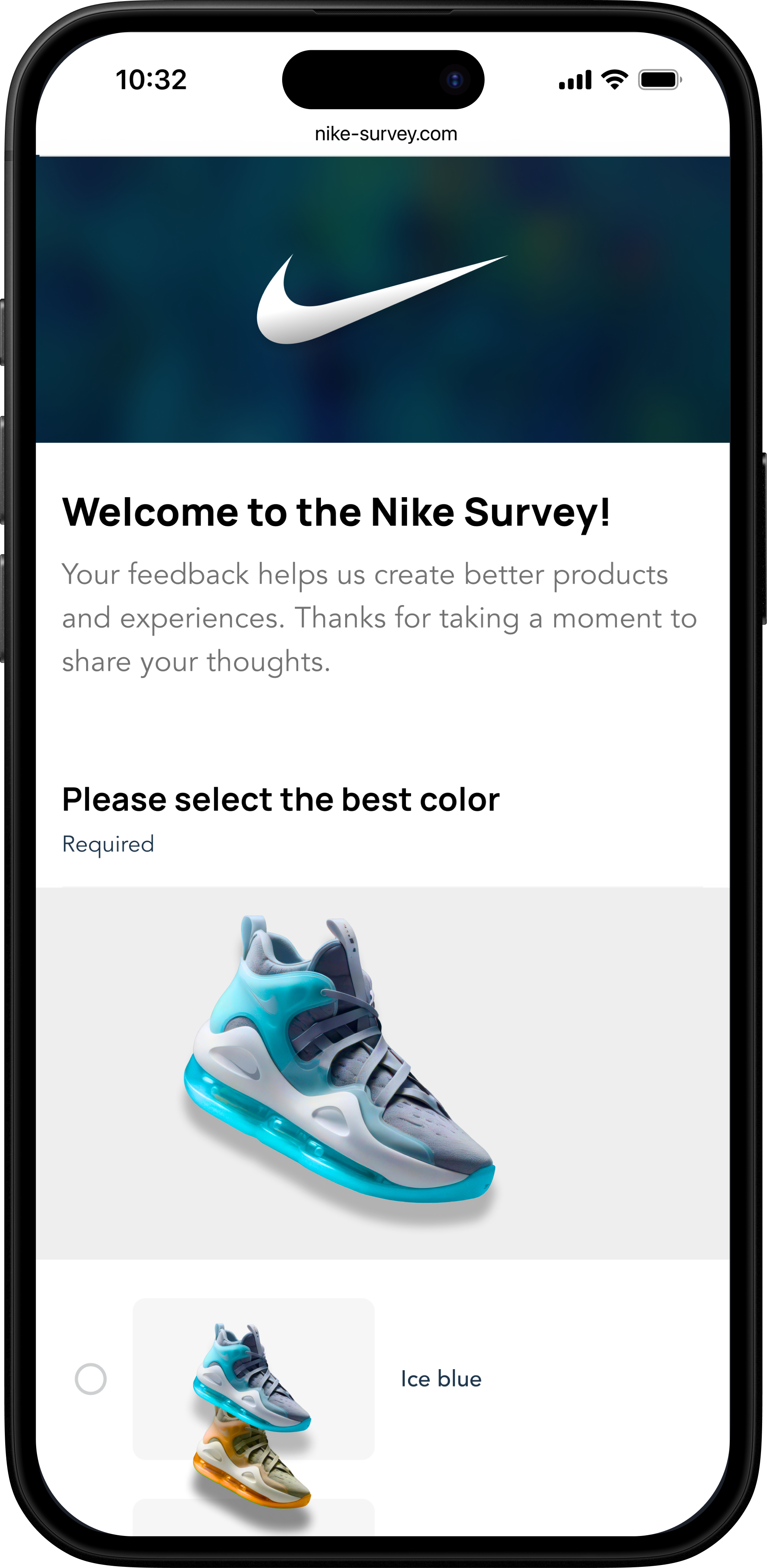
I redesigned the survey experience with a mobile-first, responsive layout. All 25 question types were rebuilt for clarity, accessibility, and ease of use. Major clients like Amazon, Nike, and Microsoft can now deliver fully branded surveys with custom fonts and colors. The new design ensures a consistent, intuitive experience across web and mobile.
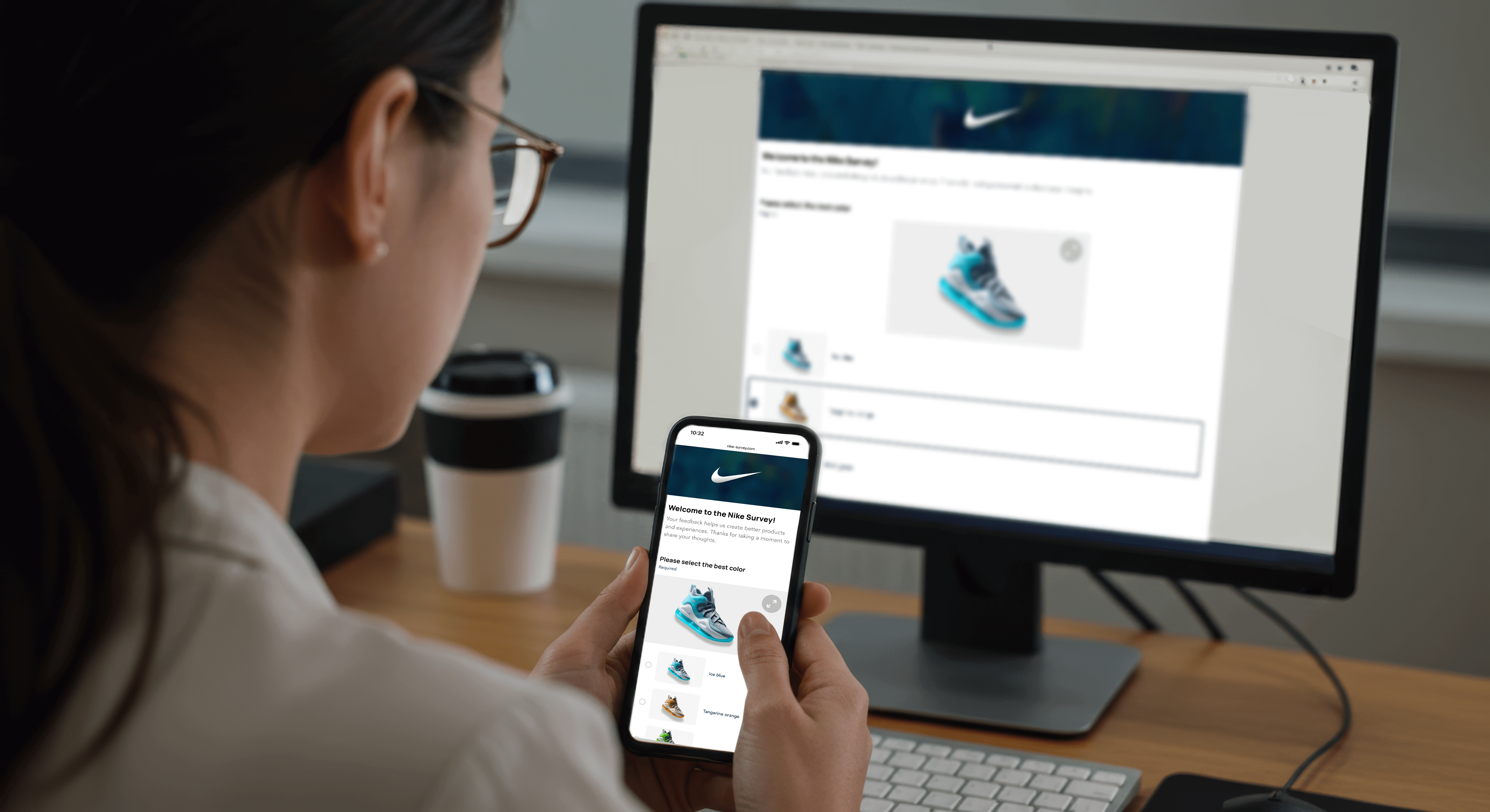
Answer surveys anywhere, anytime—seamlessly on mobile for quick, convenient feedback on the go.
Explore in 3D
Spin the model for some fun!
Key Results
A unified design system sped up development and made scaling easier.
Consistent user experience across all products improved usability and brand trust.
Redesigned surveys boosted engagement and lowered drop-off rates.
Customizable survey features impressed enterprise clients.
Team efficiency improved, supporting long-term business growth.